Shading an anime character’s skin can make or break your drawing, it’s that important! As one art instructor puts it, “shading is an essential part of drawing; it can really make or break your drawing… it allows your drawing to come to life”. Without proper skin shading, even a great line art can look flat and lifeless. In this tutorial, we’ll demystify the skin coloring process with clear, beginner-friendly steps. By the end, you’ll know how to add depth, warmth, and realism to your anime characters’ skin. Let’s get started!
Tools of the Trade
Before we dive into coloring, let’s talk tools. You can achieve beautiful skin tones with either alcohol markers or colored pencils, and each has its pros and cons:
- Alcohol Markers (e.g. Copic, Ohuhu): These are hugely popular for anime art due to their vibrant colors and seamless blending. Markers lay down smooth, flat color quickly, almost like digital coloring, which is great for covering large areas without streaks. They blend by layering, allowing you to create soft gradients or cel-shaded looks easily. Keep in mind markers bleed through thin paper and dry fast, so work on marker paper and blend while the ink is wet. Recommended Colors: For a basic fair anime skin tone, many artists use Copics like E00 (base tone), E11 (shade), and a touch of R20 (blush). (For an even lighter base, you can start with E000, a very pale skin tone.)
- Colored Pencils: Colored pencils offer precision and control, making them ideal if you enjoy adding fine details or softer shading. You can layer lightly to build up skin tones and create subtle gradations. Pencils don’t give the same flat coverage as markers, they create a bit of texture, but you can blend them with blending stumps or just by layering multiple tones. This medium is more time-consuming for large areas and achieving perfectly smooth skin takes practice. On the plus side, pencils won’t bleed through paper and are very beginner-friendly. (Tip: look for a set that includes peach, light brown, and pink tones, or use a light peach base, a tan shade for shadows, and a soft pink for blush.)
No matter which medium you choose, testing your colors on scrap paper first is always a good idea. Now, let’s jump into the coloring process!
Step 1: The Base Coat (Lay Down a Smooth Color)
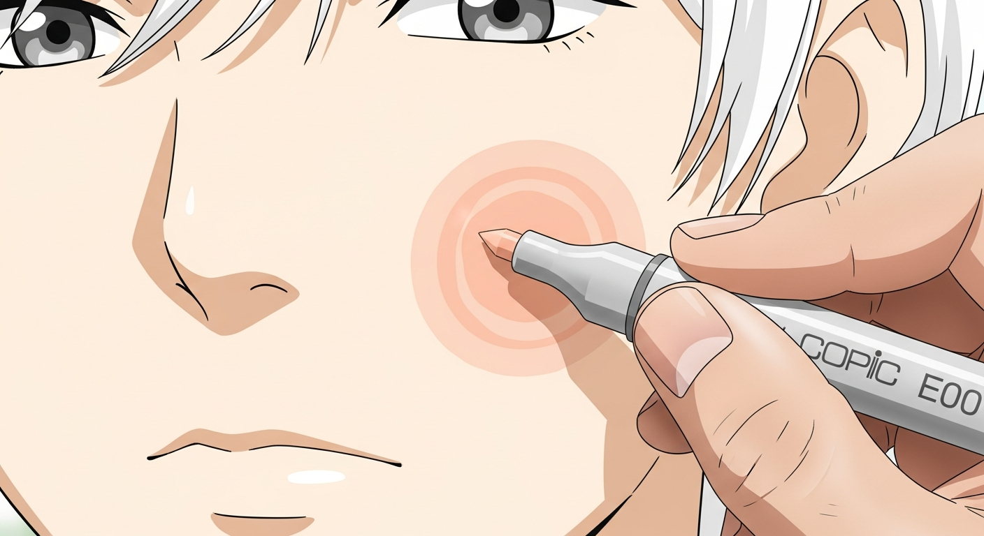
Base layer of anime skin tone applied with Copic E00 marker
The first step is to cover your character’s skin with an even base coat of color. This base will represent the lightest skin tone (the areas where light hits directly). Here’s how to do it:
- Markers: Use your lightest skin marker (for example, Copic E00 or E000) and fill in all the skin areas with a smooth, even layer. Work in small sections and use a consistent motion (try little circular strokes or side-by-side streaks) to avoid any patchy lines. Alcohol markers are great at laying down a flat, streak-free layer if you keep the ink flowing while it’s wet. Don’t worry if it looks slightly too light, we will build up depth in later steps. Pro tip: It often helps to color the skin first, before hair or clothes, so darker inks from those areas don’t accidentally bleed into the skin area.
- Colored Pencils: Choose a base skin color pencil (a light beige or peach). Using light pressure, color the entire skin area with small, overlapping circles or soft strokes. The goal is a uniform layer without obvious pencil lines. If the color isn’t even, layer a bit more until it’s smooth, but avoid pressing too hard at this stage. The base should be a light tone, you’ll add shadows and blush on top gradually. If you have a blending pencil or a tortillon, you can gently blend the base to even it out, though it’s usually not necessary for the first layer.
Remember to preserve tiny highlight spots, for instance, you might leave a tiny dot on the nose or lower lip white, or very lightly colored, to mark where the brightest shine will be. With markers, you can simply avoid coloring a small spot (or use a colorless blender to lift color later), and with pencils you can lightly erase or leave those areas. These little highlights will make the skin look dewy and dimensional later.
Step 2: The Shadow (Adding Depth with Shadows)
With the base down, it’s time to add shadows and give the skin form. This is where your drawing really gains depth. First, identify where to place the shadows on your character. In anime art (assuming a standard light source from above or the front), common shadow areas include:
- Under the Hair: Hair hanging over the forehead will cast a shadow on the skin. Shade the forehead or sides of the face where bangs or strands overlap. These are usually somewhat sharp-edged shadows following the hair’s outline.
- Under the Chin (Neck area): The head blocks light to the neck, so you’ll almost always have a shadow under the chin, across the top of the neck. This can be a crescent or wedge shape that defines the jawline. It’s often one of the darkest shadows on the skin because less light reaches there.
- Around the Nose and Eyes: Anime-style noses are small, but you can still add a tiny shadow to one side of the nose and right below it. The eye sockets (upper eyelids) can also have a thin shadow to show depth. These details are subtle but make the face more three-dimensional.
Once you know where the shadows go, apply your shadow color. Use a slightly darker tone than your base. For markers, that might be Copic E11 (a shade or two darker than E00). For pencils, you might pick a light tan or light brown. Gently shade in the areas we identified.
Now, let’s talk about hard vs. soft edges for shadows. In anime and manga, you’ll see two approaches:
- Hard-edge shadows have a crisp boundary: this is typical in cel-shaded styles (think of anime cels where the shadow is a flat shape). For example, the shadow under the chin might be a clearly defined shape with a hard edge. Use a hard edge when the shadow is a cast shadow (one object blocking light from another). The hair casting a shadow on the forehead, or the chin casting a shadow on the neck, are usually drawn with a firm edge. It gives a bold, clean look.
- Soft-edge shadows transition gradually: these are more realistic, where the shadow fades out at the edges. They’re great for form shadows on curved surfaces, like the cheeks. A soft shadow might be used for a gentle crease or where light rolls off a rounded area. It makes the skin look smooth and adds realism.
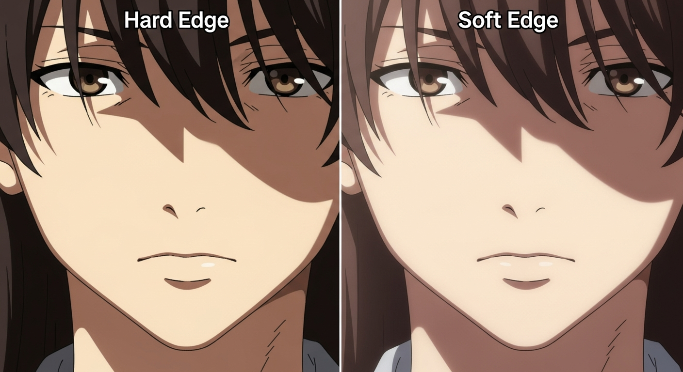
Comparison of hard edge and soft edge shadows on anime face
In practice, you can use both: have some shadows with hard edges and some with soft, or even one shadow that starts hard and fades out. A handy beginner tip: give each shadow one hard edge and one soft edge. For example, under the chin you could draw the top of the shadow (along the jawline) with a sharp edge, and let the bottom of that shadow gradate softly into the neck. Or on the face, the shadow under the hair could be distinct at the hairline, then soften out as it goes down the forehead. This mix makes the art look dynamic and prevents the shadows from looking too harsh or too flat.
How to soften a shadow: With markers, you can feather the shadow by going over the edge of it with your lighter base color marker. Essentially, color on the border of the shadow and the base, and you’ll see the line blur as the inks blend. You can also touch the tip of your lighter marker to the darker one (a blending trick) to pick up a bit of the darker ink and blend on paper. With colored pencils, apply less pressure at the edge of the shadow and use small circular strokes to fade it out. You can also use a blending stump or a lighter pencil to smooth the transition. Take your time here, building up a nice gradient makes the skin look 3D. And don’t worry if it’s not perfect right away; you can always layer more.
Finally, remember that shadow color matters. For a warm skin tone, shadows that are too saturated or too dark can look odd. A good rule: use a slightly desaturated, darker version of your base tone for shadows (for instance, a beige with a hint of gray or a touch of a cooler tone) rather than a super bright orange or pure black. Real skin shadows tend to be more muted because shadows absorb light (thus color) rather than reflect it. So, something like Copic E11 (a bit duller/browner than E00) or layering a light gray over your pencil base can work well. You can experiment with adding a tiny bit of a cool tone (e.g. a light blue or purple) into the deepest shadows for realism, but that’s optional and stylistic.
At this stage, you should see the face and body “pop”, the shadows create volume. The cheeks look more rounded, the chin separates from the neck, and the character’s features have form. Great job! Keep the shadows fairly light for a softer look, or deepen them if you want a dramatic effect. Just maintain a balance so the skin still looks clean.
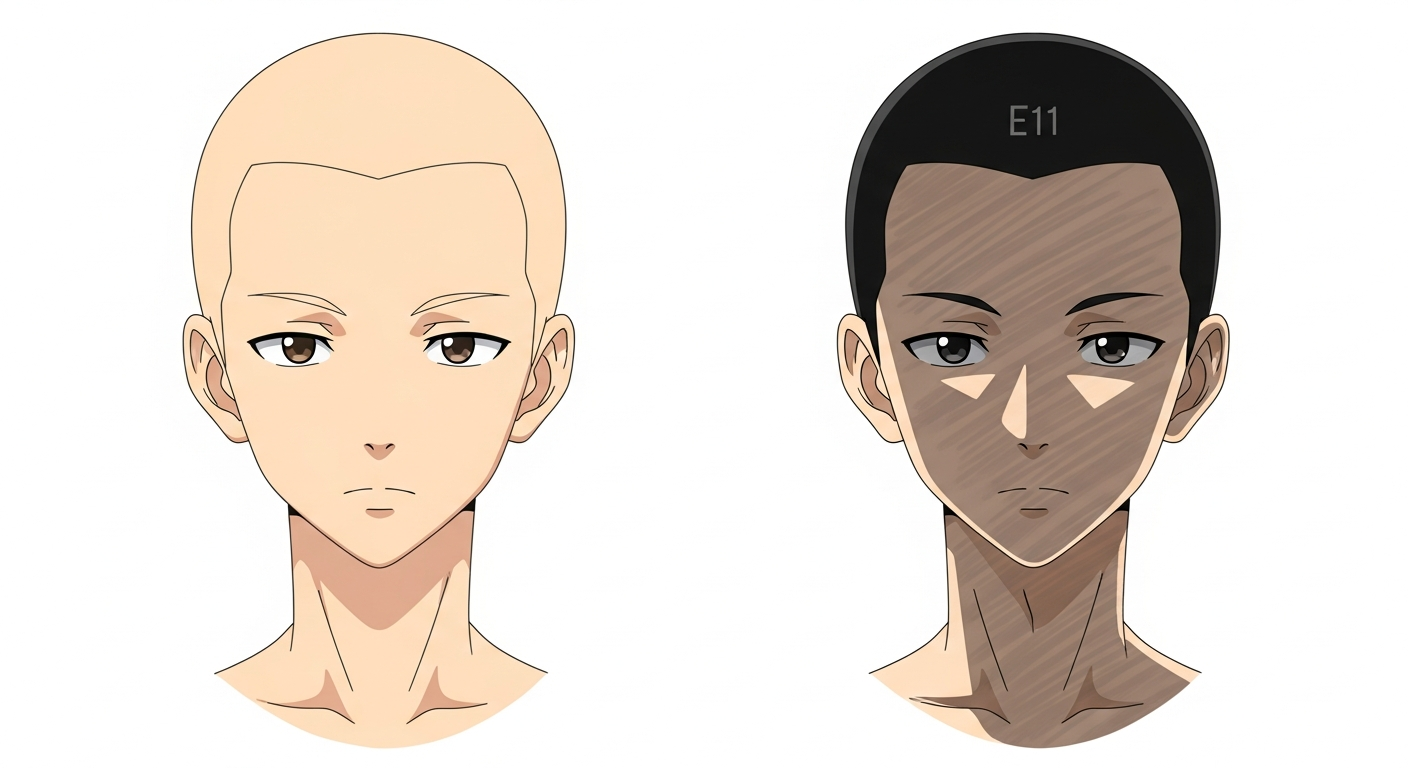
Before and after shading on anime face and neck
Step 3: The Blush & Highlights (Adding Life to the Skin)
Now for the finishing touches that will make your anime character look alive! Skin isn’t all one color, subtle reds and highlights bring warmth and realism. In this step we’ll add blush (rosy tones) and highlights.
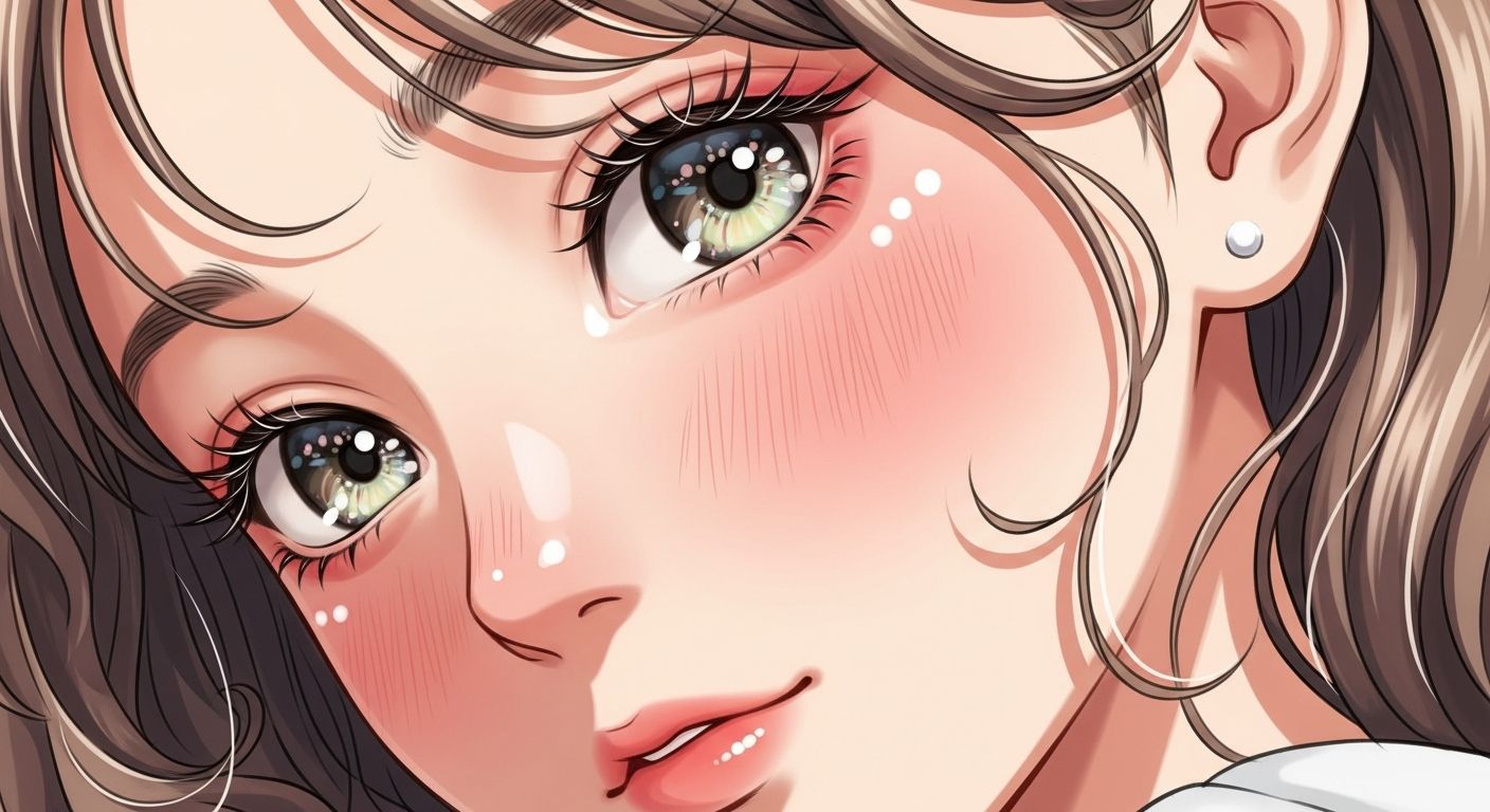
Anime face with subtle blush and white highlights
Blush: Adding a slight blush to areas like the cheeks instantly makes a character look more vibrant and cute. For a fair-skinned anime character, a common choice is a light pinkish marker like R20 (Blush) or a colored pencil in a rosy pink tone. Apply the blush on the cheeks, usually the upper cheek area, just under the eyes or towards the side. You can do two small ovals or circles of blush on each cheek, then blend out the edges so it looks soft. In anime, sometimes the blush is stylized as just two pink lines or a bigger flushed area; you can decide the style, but keep it subtle enough to look natural. Besides cheeks, you can dot a tiny bit of this blush color on the nose tip and earlobes, because in real life those areas might flush a little pink as well. With markers, lightly layer the pink, one pass is usually enough since it’s a strong color. With pencils, use light pressure and small circles to softly tint the area. The result should be a gentle pink glow, not a harsh red spot. If it looks too strong, go back with your base skin color and lightly blend over it to tone it down.
This rosy touch “brings illustrations to life,” giving the skin a healthy appearance. You’ll notice your character suddenly looks more lively and friendly with a bit of blush. It’s an optional step, but highly recommended for that charming anime look!
Highlights: Highlights are the spots where light hits the skin most directly. In cel-shaded anime art, highlights on skin are often minimal, but in colored illustrations you might add a subtle shine on areas like the bridge of the nose, forehead, or bottom lip. The key with highlights is to keep them small and subtle, a little goes a long way. You’ve likely already left the brightest areas lighter from Step 1 (your base coat). Now you can enhance them if needed.
For example, you might take a white gel pen or a very light pencil and put a tiny white speck on the tip of the nose or the lower lip to show a bit of shine. Or use a colorless blender marker to gently lift a tiny highlight on the top of the cheeks. If the forehead is visible and you want it to look dewy, you could very softly erase or lighten a slight oval area on the top center of the forehead as a highlight. Just be careful: overdoing highlights can make the skin look oily or plastic. You generally don’t want big white patches on skin, especially in anime style, keep it delicate. A small sparkle in the eyes or a tiny nose shine is usually enough for a cute effect.
After adding highlights, take a step back and look at your character’s face and skin overall. The base gives the skin its main tone, the shadows add depth, the blush adds warmth, and the highlights add a touch of realism and gloss. You can tweak any of these by layering a little more: deepen the shadows if the skin looks too flat, add more blush if the character looks pale, or add a bit more highlight if you want a shinier look. It’s all about balance, for instance, strong cel-shading style might skip soft highlights altogether, while a more painted style might include lots of gradation. Find the look you like. If you’re a total beginner, this three-step approach is a safe formula.
Congratulations, you’ve colored the skin! It should look smooth, dimensional, and full of life. A well-shaded skin really makes your anime drawing stand out. Before we finish, let’s cover a few common mistakes to avoid, so you can troubleshoot any issues in your work.
Common Mistakes to Avoid
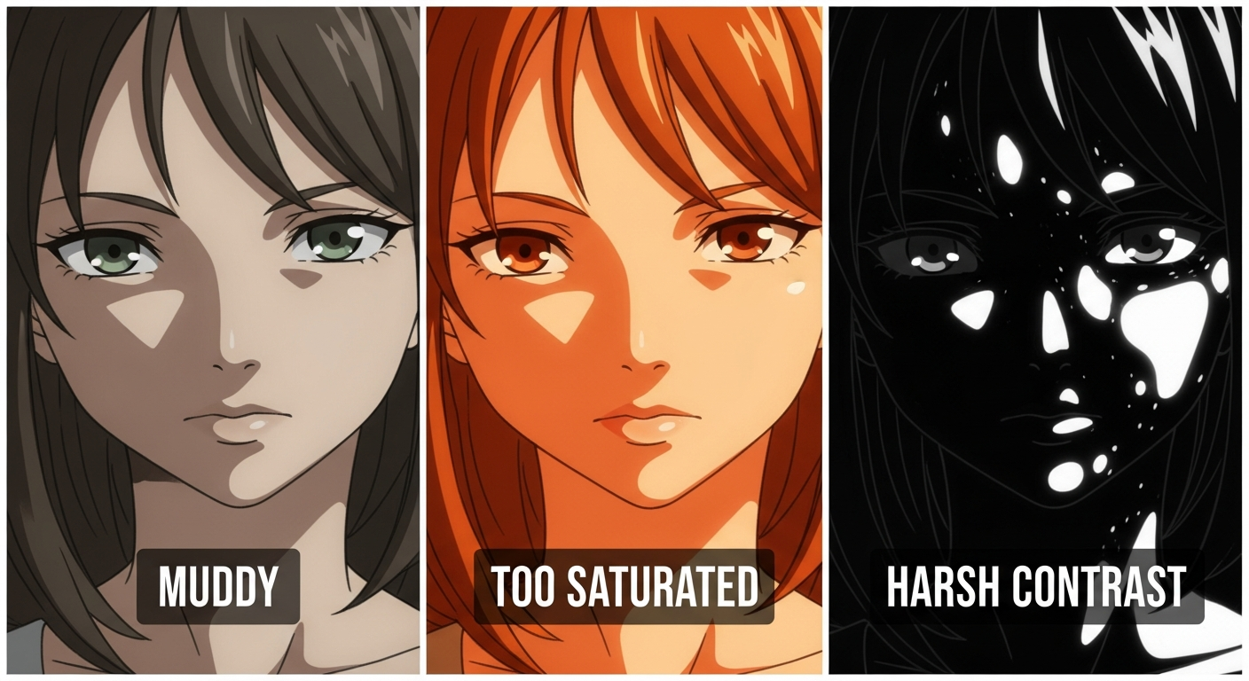
Examples of common mistakes in coloring anime skin tones
Even seasoned artists make mistakes with skin tones. Here are some common pitfalls (and how to avoid them):
- Muddy Skin Tones: This happens when you use too many different colors or layers and over-blend everything, resulting in a dull or dirty look. Remember, with skin often less is more, it’s better to use a base plus one or two shadows than to layer the entire rainbow. Using too many marker colors can make the skin look “muddy” instead of luminous. To avoid muddiness, stick to a limited palette for the skin (for example, a base, one shadow, one blush) and let the paper show through to keep colors bright. Also, if you’re using complementary colors or a lot of gray to shade, use a light touch so the result doesn’t go brown or gray. When blending, don’t blend so much that all contrast disappears, a bit of distinct shadow and light is good. If you find your skin looking muddled, you can lift some color (with a blender marker or gentle erasing) and re-establish the highlights and shadows so there’s clarity.
- Overly Saturated Color: It’s easy to get carried away with a super pink or orange skin tone, but beware of neon skin! Over-saturated skin colors or shadows can look cartoony in a bad way (think bright orange spray-tan). In general, skin will look more believable if the colors are somewhat muted or natural. If your base skin color is very vibrant, consider toning it down by layering a tiny bit of a complementary color (for instance, a light blue over a very orange skin to neutralize it). As one art tip notes, shadows on skin should never be more intense in color than the midtones, real shadows are more gray/brown because they have less light. So don’t shade a light peach skin with pure red, it will look odd. If you think your colors are too saturated, you can desaturate by adding a bit of a neutral color over it (a light gray marker, or a soft layer of a complementary colored pencil). Often, beginners using digital tools choose colors that are too pure, selecting more skin-like hues (a bit towards gray/brown) helps. In summary, avoid clownishly intense colors unless your style intentionally calls for it. Natural-looking skin has a balance of warmth and neutrality.
- Harsh Shadows or Highlights: Another mistake is using extreme contrast on skin. For example, coloring a shadow with pure black, or leaving a highlight as pure white on a medium skin tone. Extremely dark shadows (too much black or too many layers) can make the skin look dirty or separated from the rest of the drawing. Instead of black, use a darker shade of the skin color or add a little cool tone for depth. And for highlights, pure white spots can look like stickers if they don’t blend in, unless you’re depicting wet skin or a strong shine, keep highlights slightly tinted (e.g., a very light peach rather than white on light skin). Also, watch out for shadows that are too large and soft, if you shade almost the whole skin with a soft airbrush, it can all become one mid-tone mess. Every shadow you add should have a reason (like “hair is casting this shadow” or “the arm curves away here”), not just randomly placed. Aim for clear, intentional shadows and leave some areas in pure light. In short: balance your values. Don’t make the darkest part of the skin too dark or the brightest part too stark. Aim for a pleasing contrast where the highlights, midtones, and shadows are distinct but harmonious. This will prevent that “over-rendered plastic” look.
By keeping an eye on these issues, muddiness, over-saturation, and extreme contrast, you’ll ensure your colored skin looks its best. If something seems off, usually you can fix it by lifting some color, adjusting the hue, or re-establishing your lights and darks.
Finally, remember that practice and observation are key. Try studying photos or anime screenshots to see how skin reacts to light. You’ll notice subtle things like the knees often a bit reddish, or how shadows on a face have crisp edges in direct sun but soft edges in diffuse light. Incorporating those observations will elevate your coloring over time.
Time to Practice!
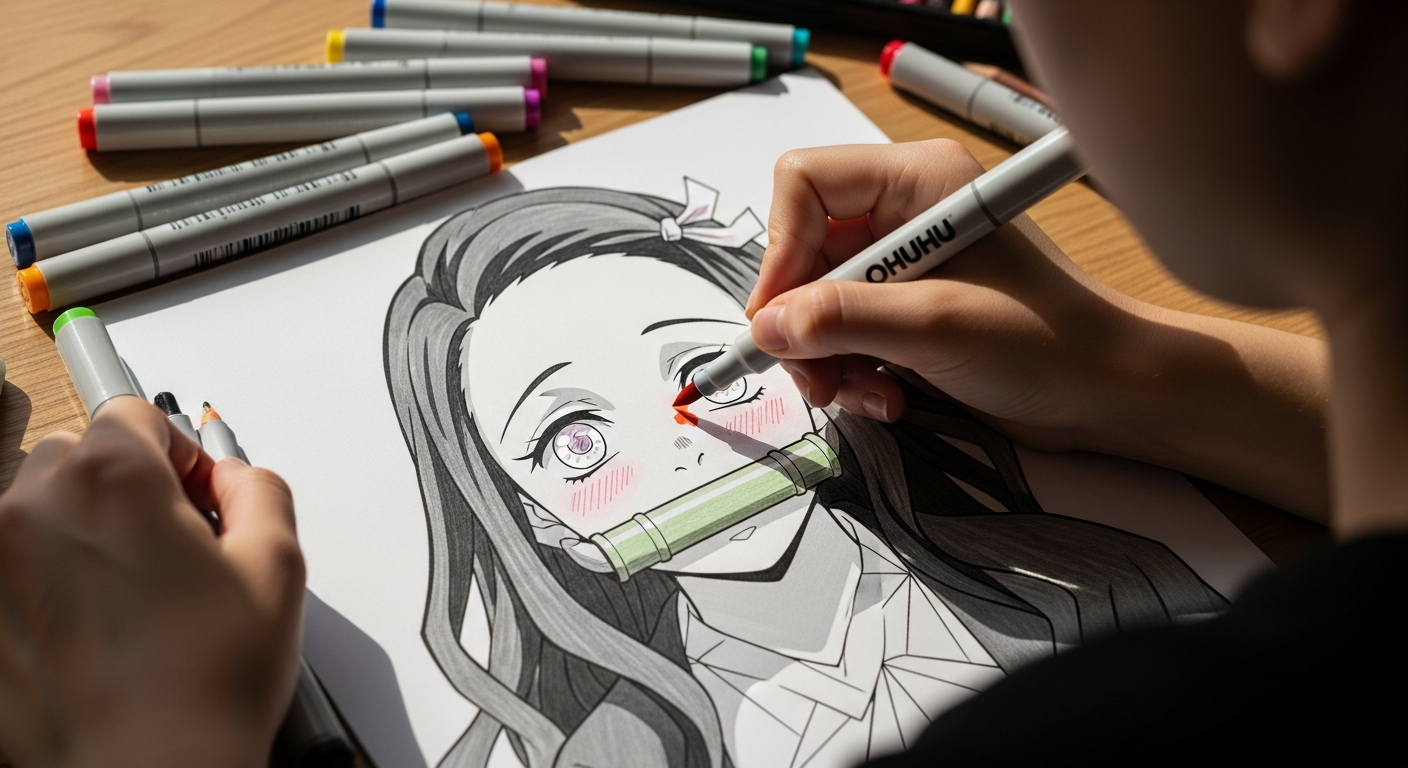
Artist practicing anime skin shading on Nezuko coloring page
Now that you’ve learned the basics of anime skin coloring, it’s your turn to have fun with it. Grab your markers or pencils and practice these techniques on some ready-to-color art. A great way to apply your new skills is by using coloring pages of your favorite characters. Head over to YoloColoring’s Anime & Manga category where you’ll find awesome free printable pages, from Goku to Nezuko and other Demon Slayer characters. Print one out and try shading the skin following our 3-step process: lay the base, add shadows in the right spots, and finish with blush/highlights. You’ll be amazed at how much depth and life you can create!
Don’t be afraid to experiment, every artist has their own style, and the more you color, the more you’ll discover what looks good to you. Keep these tips in mind, but also have fun and be creative with your color choices. With practice, you’ll get more confident in blending and shading, and your anime drawings will only get better.
We hope this guide helped demystify the process of coloring skin. Remember, even the pros started as beginners, so stay enthusiastic and keep improving. Now go bring those characters to life with beautiful skin tones, happy coloring!

Sophia Williams is the voice of the YoloColoring community. As our Content Editor, she crafts all the helpful articles, guides, and descriptions you read on the site. She is also our Community Manager, dedicated to connecting with users, celebrating their creations, and fostering a warm, supportive environment for all colorists.
